UI
UI Manual
- To build KNUE’s identity and widely declare the foundation and values of the university both internally and externally
- To enhance public awareness of KNUE through the visual image of the UI
UI’s Meaning
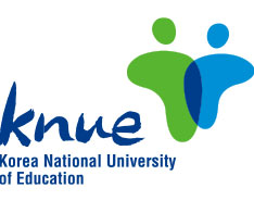
The “T” shape draws inspiration from the Korean letter “ㄱ” in “교원대” (University of Education). It symbolizes the meeting, sharing, and unity among all KNUE members—staff and students alike—while also representing the growth into mature and well-rounded educators. This growth is rooted in tradition, future aspirations, fundamental values, and innovation. The green conveys a stable and friendly image, while the blue signifies enthusiasm and intelligence.
Symbol Mark
KNUE’s symbol mark must be used consistently in its designated form, as it embodies the university’s core values and vision: growth through the pursuit of truth and the formation of outstanding individuals. The open book within the symbol mark represents the enthusiastic pursuit of academic inquiry, while the candle signifies the noble spirit of educators dedicated to love and devotion. The expanding bright light symbolizes the progress of ideal education and the realization of happiness, highlighting KNUE’s role as a leading and central institution. The dynamic blue color reflects the bright future of educators, driven by youthful ambition and forward-thinking aspirations.
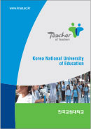
Logotype
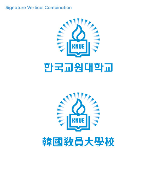
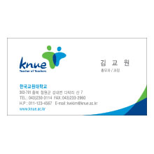
Signature
The signature represents the most logical and organized combination of KNUE’s symbol mark and logotype, serving as the most effective way to establish and communicate the university’s image. The vertical Korean combination can be adapted based on the specific requirements of the media in use.


Slogan/Character


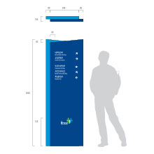
Et cetera


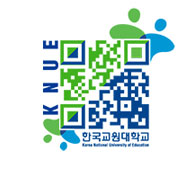
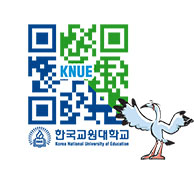
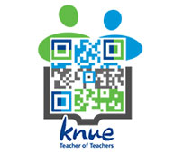
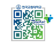
QR Code (Quick Response code)


40th Anniversary Logo & Catchphrase
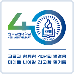
- Logo : To mark KNUE’s 40th anniversary, the number 40 is designed as a key, symbolizing that the university serves as the key to unlocking the future of Korean education.
- Catchphrase : The phrase reflects on KNUE’s 40-year journey of nurturing and fostering teachers and advancing Korean education since its establishment. It outlines the path KNUE will take to shape the future of education in Korea and reaffirms the university’s commitment to strengthening its role as a leading institution in pioneering future education.